
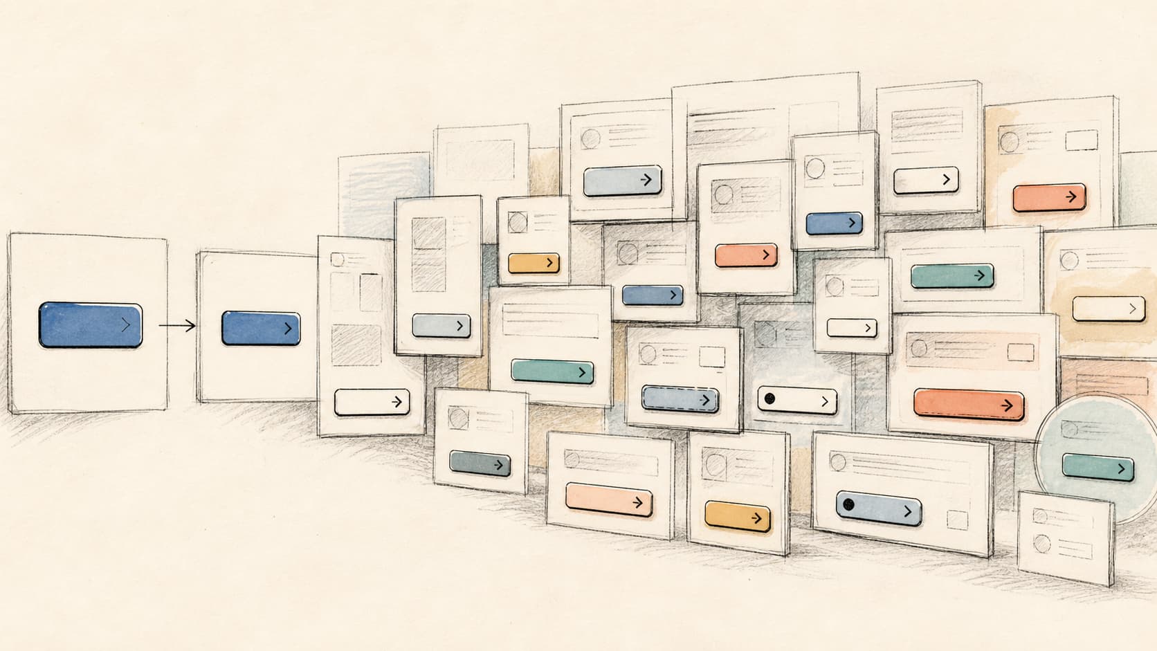
How One Blue Became Four Blues (and What That Costs You)
Design drift isn’t new.
Teams have been quietly drifting away from their own design standards for as long as design standards existed. A button here gets a slightly different shade of blue. A form there gets its own spacing. None of it looks like a problem in the moment. Anyone who’s worked on a product team knows how easily this happens without anyone noticing.
AI increases the speed at which design decisions are made, and will happily guess and make them without your input. That’s true whether it’s a professional dev team using an AI coding assistant across an established product, or someone building a new app from scratch by describing what they want to an AI agent. More screens, more decisions, less time between them. Drift spreads faster and further before anyone notices.
What I actually found
I built a AI chatbot and an admin portal with 19 screens over a few months. I gave the AI a brand and style guide upfront, and explicitly asked it to build and reuse a consistent design system from the start, rather than making them up screen by screen.
When I checked the result, 18 of the 19 screens had gone off-script, not just a handful of outliers.
The biggest problem was that the bot and portal didn’t even agree on what its own colours were. The same shade of grey was written four different ways. Two different blues that were clearly meant to be the same blue. Ten different ways of describing what turned out to be only three real corner shapes.
That a tells you how hard the fix is. If the same colour has been written in four ways, you have a labelling problem. You know the right colour code, just called it something different along the way. Pretty cheap and fast to fix because the real decision on which colour is correct hasn’t actually shifted.
If you have four different colours that are only a shade or two different, you now have a design problem. You know blue was part of your design but suddenly have multiple versions and have to determine which one to keep. I unfortunately had both problems.
Why one small slip becomes a big one
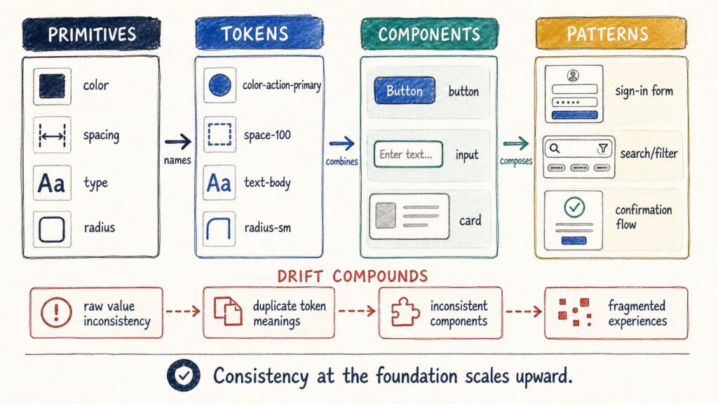
Think of how a product’s design gets built, in four layers, each one built on top of the last:
- The raw decisions (Primitives): what exact colour is your blue, how much space goes between things, what size is your body text
- The named version of those decisions (Tokens): instead of retyping the exact shade of blue every time, you give it one name and reuse it everywhere
- The reusable pieces (Components): buttons, forms, cards, built once using those named decisions
- The full experiences (Patterns): sign-up, search, checkout, built by combining those reusable pieces
A small slip in the raw decisions (someone types the blue slightly wrong) becomes a second, slightly different named version of “the same” colour. That gets used inside a handful of buttons and cards. Those buttons and cards show up across several different screens. One tiny typo, multiplied at every layer above it.
My product had 873 of these off-script decisions, spread across colours, spacing and shape. The worst screens were in the portal and each carried 50 to 70-plus individual slips on their own.
What actually fixed it, and what didn’t
I built a tool that scans the codebase and flags every place a raw decision was made instead of reusing the named, agreed-on version. I also built a second check that compares what the design system says exists against what’s actually been built and shipped, because those two things drift apart too. That gap is the difference between what a team believes it has and what’s actually there.
From there, the fix was: merge duplicate versions of the same decision down to one, fill in the genuine gaps, replace hard coded raw values with the named, reusable version, and bring every button and card back to a single shared source of truth. The part that actually made it stick was adding an automatic check that blocks new off-script decisions from being added at all, the same way a spell-checker stops a typo before you hit send.
The result: 873 off-script decisions reduced to 89. And for the worst offenders, the drop wasn’t just lower, it was permanent. A raw colour typed directly into the code, or an old colour that’s supposed to be retired, simply can’t be shipped anymore. The system blocks it automatically, before it ever reaches production.
A smaller number of harder judgement calls (which grey counts as background versus which one signals a warning, whether a particular rounded corner is really a new shape or a mistake) are still being worked through. Those are tracked on a visible, shrinking list rather than hidden, so new ones cannot silently be added without it being flagged and stopped.
I later added two more checks, for text size, and my combined total across everything I now track is 258 remaining, down from 1,336 in the original scope. Not a clean line to zero, yet. But a counted, shrinking, visible number, instead of an unknown one nobody’s tracking. I also now know exactly what is undefined and can work on resolving that rather than adding to it.
The real test came after the fix and guard was applied. I made significant changes across multiple pages, and no new drift appeared. A colour change that used to mean manually touching roughly 400 different spots in the code could now be made once, in a single place.
Why this matters more, not less, with AI
None of this means AI-assisted development is bad. It means the foundation matters more, not less, when AI is involved.
AI is very good at reusing a system that’s clearly defined. It’s just as good at making up a reasonable-looking answer when the system isn’t defined, and each of those answers can look fine on its own screen while quietly pulling the whole product out of sync. A human team does the exact same thing. AI just does it faster, which means the gap between “looks fine” and “over a thousand small inconsistencies” can expand before anyone’s looking for it.
The real measure of a well-built product isn’t how many screens shipped in the first week. It’s whether that product is still easy to change on day 200, after 40 more screens have been added.
Getting there takes more than a style guide sitting in a shared drive that nobody opens. It takes an honest audit of what’s actually in the product, not just what the documentation claims should be there, plus something automatic that stops new mess from creeping back in the moment nobody’s watching.
If you’re looking at a product’s design you suspect has drifted, AI-built or not, start with one simple check. Count how many different ways your describing the same colour. Most of the time you’ll find there’s already a correct answer, and it’s just drifted. A pretty simple labelling and enforcement fix. Occasionally you’ll find nobody actually agreed on it in the first place. That’s the case where you’ll need a real design decision, before reaching for a AI tool.
That count doesn’t have to be manual
Want to test my tool against your code base and see how much design debt you’ve accumulated?
One Comment